Monday, 16 April 2012

Week 18 - Music Double Page Spread

My double page spread follows the codes and conventions of other music magazine double page spreads.

I started off by making layers and 2pages

Next I chose a background color and applied it to my two pages and added a plain white banner

Next I inserted my images making sure the background color of them was the same as the background color I was using in InDesign (I did this through photoshop)

Next I added text to my banner and added another banner/adveritsement ot the bottom right of the second page, promoting my artists second album

Next I added all my text, pull out quotes and title.

 
I feel that my double page spread can be improved. I feel the color used for the background needs to change as it does not relate to the color's used on my front cover. Also finding text colors that fit well with the current color of my background will be quite difficult.

Loved the font used for the title here and the very simplistic color scheme

The image used to the right is very attention grabbing. I really liked and appreciated the use of eye contact here.

This double page spread I thought was very playful and fun. The colors used work well together and the layout of the page had a big impact on me as I wanted my readers to be able to locate information on a page easily the way I was able to with this double page spread.

This double page spread is where I got my idea to merge the image into the background for as I feel it gives a sense of proffesionalism and class.


Although the colors used for the actual interview page I felt were very dull and boring the image is very engaging and as a reader made me want to read on to find out why she has this huge smile on her face.


My intention was for my double page spread to represent a different ideological view of female Indian rap artists than I feel are currently being portrayed throughout music magazines. I feel that within the genre of rap in Indian music culture, female artists aren't taken as seriously as the male artists are and they either embrace one side more than the other (rap culture) or (Indian culture). My artist Yashawini Bah is an Indian woman who promotes and embraces two cultures that she loves. Yashawini is what we would call 'new money' in the social demographic table. She was not born with a silver spoon in her mouth; in fact the complete opposite. Her parents were quite poor and she has worked hard for her success.


My artist embraces both sides of her culture

My artist embraces both sides of her culture


My audience will see themselves reflected through my magazine through the use of colors, the cover stories and the ideological context that is conveyed. 

Week 15 - Music Contents Page Post Production

Looking  back on my idea's before the actual production of the contents page I always intended to abide by the forms and conventions of real music magazines. I feel I havce done so as my contents page features an editors corner, well placed images and captions, sub headings, a consistent color scheme and many more things you would find in a music magazine that is currently on the market.


What have you learnt about technologies from the process of constructing this product?
I have learnt valuable skills when using a digital camera, I have learnt how to take pictures at many different angles and how to adjust the images directly from the camera. 


This is an example of a close up shot. I also adjusted the color and brightness directly from my digital camera.

This is an example of a medium shot taken from a top view (not birdseye) but higher than you would usually take a photo. I did not however adjust this image, I left it as it was.

This image is taken from a worm view and has also not been edited.

I also researched on the internet to get a better understand of how camera angles work and what looks most effect for different purposes.


I also learnt that sometimes adjusting images directly from my digital camera made it easier when creating a document in InDesign.

Looking back at my preliminary task I feel that my product has progressed greatly as I have a solid idea of how I want the layout of my magazine to be and how this will impact on the sales of my magazine.

After the production of my magazine contents page I looked back at all the contents pages I had looked at online and tried to see and analyse which ones had an influence on the contents page  I created.

I think that the inspiration I gained from this contents page was the link between the colors in the background to that of the artist and text.

I felt that this contents page was effective through the clear bold font for subheadings making it easier for readers to locate specific information. Although I felt it could have done with more images on the page, I feel the use of banners and advertorials made up for this.

I think this contents page influenced me the most because of its simple color scheme. I also thought the positioning of the word 'contents' and the date was well done and incorporated this idea into my own contents page.

This contents page is largely dominated by the image, this is effective and would grab readers attention because the market of magazine readers as a whole is going from 'readers' to 'viewers'. Audiences enjoy having  a flick through a magazine than actually reading the articles, so if a picture has great impact and attracts the readers attention the readers may be more willing to read the article regarding the picture.


Week 14 - Music Contents Page Production

Creating the contents page of a music magazine was the first part of our main task. I chose the genre of world music for my magazine as I feel there are currently no magazines on the market that advertise this style of music. I also chose this genre based on the facts that I know nothing about it and it would be a learning process for me too and its quite an open genre so there would be a lot I could do with it within a magazine to make it interesting for my reader.

I had an idea for my contents page to carry out a completely different color scheme to that of the front cover because the colors I used on my front cover did not work very well together.


I am designing my contents page to use the conventions of real music magazines as the slogan is usually included on there like mine is.


Also I feel I am abiding by the forms and conventions as my contents page features an editors corner, well placed images and captions, sub headings, a consistent color scheme and much more.


My media product represents different types of ethnic groups and social groups as I have a diverse range of people featured on my contents page, I show and promote that everyone is different and that is a positive thing through attire worn, text, cover lines etc.


I am attracting my audience through careful research on exactly what they would like to see featured (I carried out a questionaire which I showed in another blog). Through relevant color scheming and featuring articles and musicians my readers will be enthusistic to read about.

Here are some of the catchy cover lines I used :

  • Glen D'Angelo's deadly comeback tour
  • What music genre are you?
  • Brazilian beauty Ana Rocha on her 15 years in the spotlight
There were many others I think would have grabbed my readers attention.

Week 11 - Music Front Cover Post-Production

Music Front Cover Post-Production


I feel that my media product followed the generic forms and conventions of real music magazines as it had all the usual features you would find on one. Headings, images, coverlines, usp, barcode etc.


My media product also challenges the forms and coventions of real media products in various ways. There are no magazines in the world right now currently offering what my magazine does. A magazine which has a vast variety of genre's, cultures and countries.Because I'm challenging the forms and conventions of music magazines on the market at the moment, I am targeting a different and much wider audience.

I feel that looking back on the front cover I have created I reached my aims and targets of what I wanted my magazine to do.

What have you learnt about technologies from the process of constructing this product?

From creating my magazine front cover on both Photoshop and InDesign I have learnt that using layers in InDesign is important and helps when it comes to organisation and how different things look on a page. For example experimenting with fonts but not wanting to delete the background if the font is on a different layer from the background the background can be hidden by the click of a button. I found this very useful.


Looking back at your preliminary task, what do you feel you have learnt in the progression from it to the full product?


Week 10 - Music Front Cover Production

Music Front Cover Production

Carrying out extensive research and planning before the actual production of my music magazine front cover helped greatly when it came to starting the production. I already had a clear understanding of what my audience wanted and expected from my magazine through giving out questionaires about a music magazine that was not currently on the market.

The questionaire below is an example of what the general attitude was towards the idea of a global music magazine.

INCLUDE QUESTIONAIRE AND ANSWERS

My media product challenges and abides by the forms and coventions of real media products in various ways. There are no magazines in the world right now currently offering what my magazine does. A magazine which has a vast variety of genre's, cultures and countries. There are no current Indian female rap artists who wears their traditional attire whilst performing (like the artist on the front cover of my magazine does)


Harshdeep Kaur


Because I'm challenging the forms and conventions of music magazines on the market at the moment, I am targeting a different and much wider audience. My audience would have to be those who are not neccissarily focused on one particular genre but are more interested in the world of music as a whole, for example music academics.
As my target audience was men and women between the ages of 18-45 who are interested in music from different genre’s and different parts of the world.
My magazine represents social groups of various different genre's and walks of life because my magazine is all about representing and catering for the musical tates of different types of people. For example rock music is commonly linked to white men between the age of 14-45. Where as grime music on the other hand is linked to young black youth.

Stereotype of a rock artist

Stereotype of a grime artist


I hope my magazine is representing Indian woman who embrace their culture and also people who love rap music; young males & females of all types of class and socio-demographic profile because this is what my artist of the week represents.


Through my music front cover production it came to my understanding that color scheming on InDesign was harder than I thought. For example a color scheme that I had planned using a website I found through google did not look good on InDesign because the tones clashed etc so I found mysefl having to alter these at the last minute.

INSERT FRONT COVER & TALK ABOUT CLASHING COLORS

Looking back at my preliminary task I feel that I learnt that research and planning is just as important if not more so than the practical side of creating a magazine.

Week 9 - Music Front Cover Pre-production

Music Front Cover Pre-production


As the magazine genre I chose for my magazine (world music) does not currently have any of its type already on the market, I decided to do my research based on magazines from different places in the world. This is because my magazine does not focus on a particular genre from different parts of the world; it features various genre's of music from different places in the world.
For example Rap in India to Jazz in Mauritus. Every week I plan to make one country the magazines focus, along with all the other articles.

The country my magazine that I am currently producing focus' on is India (Rap sensation Yashawini Bah)


Researching names was an important part of  my  pre-production as the cultures featured in my magazine are very varied. I googled names from different parts of the world including meanings, surnames, regions etc.

This is a printscreen of some female Indian names I found on google along with their meanings


This printscreen shows the name I chose for my artist (hightlighted). I chose the name Yashawini as I thought it was catchy and I liked the meaning. 'Successful lady'.

This printscreen shows further research on names, this time from Portugal with Spanish/Italian decent.


As the theme of the week for the magazine I'm producing is India, I did some further more indepth research on it.


As India’s first female hip-hop artist, Hard Kaur’s fresh appeal has broken down barriers in the entertainment business and her music, with its generous dose of Punjabi, is celebrated from dance floors to movie sets.


Hip Hop music in India had started at around 1990 and Baba Sehgal is credited as India's first rapper.


Hip Hop music became all the more famous with the song 'Pettai Rap' from the Tamil movie Kadhalan starring Prabhu Deva(music composed by A.R Rahman). Canadian based Raghav further laid steady foundations for Hip Hop/RnB music in India. California based Punjabi rapper Bohemia became one of the best-known pioneers of Punjabi rap in the country  International artists such as 50 Cent, Mobb Deep, and The Black Eyed Peas have performed in India.


'Pettai Rap' from the Tamil movie Kadhalan


 'Pettai Rap' from the Tamil movie Kadhalan

'Pettai Rap' from the Tamil movie Kadhalan


California based Punjabi rapper Bohemia became one of the best-known pioneers of Punjabi rap


Typical Indian female hiphop artists

Nandy Kur, typical Indian female artist


In what ways does your media product use, develop or challenge forms and conventions of real media products?


My media product challenges the forms and coventions of real media products in various ways. There are no magazines in the world right now currently offering what my magazine does. A magazine which has a vast variety of genre's, cultures and countries. There are no current Indian female rap artists who wears their traditional attire whilst performing (like the artist on the front cover of my magazine does)
Because I'm challenging the forms and conventions of music magazines on the market at the moment, I am targeting a different and much wider audience. My audience would have to be those who are not neccissarily focused on one particular genre but are more interested in the world of music as a whole, for example music academics.


How does your media product represent particular social groups?

As my target audience was men and women between the ages of 18-45 who are interested in music from different genre’s and different parts of the world. I feel the social group my magazine should be representing is varied as different genre's represent different types of people. For example rock music is commonly linked to white men in the D/E category between the age of 14-45 being very masculine and strong. Where as grime music on the other hand is linked to young black youth (mainly males) in the E/U category.
So because my magazine features most genre's I think the social group it should try to focus on would be whatever the theme is for that particular week (India and Rap) so hopefully my magazine is representing Indian woman who embrace their culture and also people who love rap music; young males & females of all 'categories'.

What kind of media institution might distribute your media product and why?
Any store that you can purchase music albums from would distribute my magazine as there is something for everyone in the magazine due to the fact the genre of the magazine is wide open, there's something that will suit almost everyones musical tastes especially people who listen to almost of different styles of music. I also think online franchises such as Itunes would sell my magazine (to be delivered as maybe a monthly or weekly contract).
Emap.

Who would be the audience for your media product?
Men and women between the ages of 18-45 who are interested in music from different genre’s and different parts of the world.


All the images above represent diversity.


How would you attract/address your audience?
Through relevant color scheming and featuring articles and musicians my readers will be enthusistic to read about.

What have you learnt about technologies from the process of constructing this product?


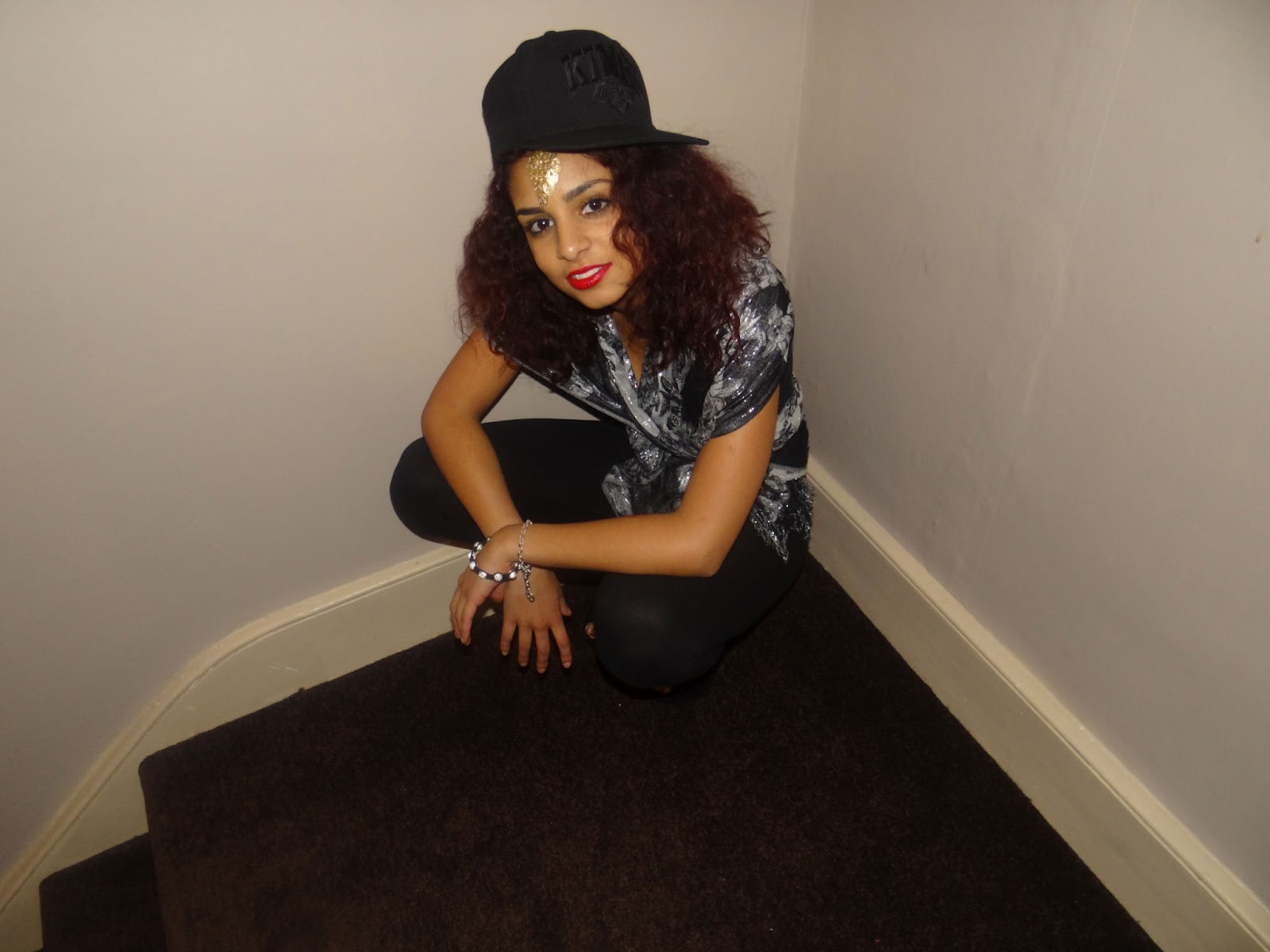
This is the original image that I inserted into photoshop. My artist had dark circles around her eyes that needed to be sorted out

After locating the correct tool to use to get rid of her dark circles this is what my image looked like

I also found out that I could change nearly everything about an image on photoshop. For example lip stick color, skin complextion, spots, scars etc.

Looking back at your preliminary task what do you feel you have learnt in the progression from it to the full product?
I feel that my understanding and respect for what a certain audience wants has broadend and I am able to carry out effective plans of action to ensure that any given media product I am creating be it college magazine or global music magazine gives the consumer what they want.


The next thing I did was start planning colour schemes, placing and cover stories for the magazine.


I started thinking of names and what different countries I'd want to be featured in my magazine.

The names I came up with were:

  • Worldwide Music
I felt this title was straight to the point and would be appreciated by readers who werent interested in fancy names but rather the actual content of the magazine.
  • Lyrically Sweet
The world 'lyrically' ties in with music and I just felt the word sweet gave it a nice ring

  • Couture Noise
I felt this was interesting and very different, I also felt the word 'couture' suggets an element of class. I chose to use the word noise alongside this as a way to express that the magazine is 'loud' it is known, it is 'heard'/read by people all across the globe. However it is still classy hence the use of the word infront of it.

  • Sweet Sensation
I liked the use of alliteration and the fact that alliterative titles usually are easy to remember and automatically attract attention.

  • Global Voice
I felt this title was strong and simple. My magazine would be seen as 'the voice for the globe'. No catches or fancy words infront just plain, simple and to the point.

  • Global Melody
This is the title I decided to go with because apart from the lovely ring it has to it. It highlights the two main reasons for the magazine. It will be known globally and is a 100% about music.

These were just a few of the names I had thought about.