In what ways does your media product use, develop or challenge forms and conventions of real media products?
Front Cover
INSERT FRONT COVER
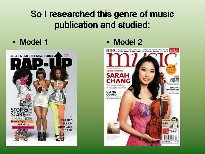
My world music magazine uses, develops and challenges the forms and conventions of real music magazines. My magazine uses the forms and conventions as it contains features that you would find in read magazines; masthead, bar code, main article, one main cover photo and many others.
Although these fronts covers are from Grime/Hiphop magazines, through research I found that this layout was the generic way magazines and layed out in almost all genre's of music.
I carried out extensive research on music magazines currently on the market both in England and abroad across various different musical genre's. The knowledge that I gained through carrying out this research helped greatly when it came to planning the production of my front cover. I was aware of what musical collaborations would work best with certain countries, due to the fact it would be something new and fresh that hadn't been seen before.
My magazine features many interesting collaborations, here are a few:
- Rock in Russia
- Hiphop in Ghana
- Opera in Guam
- Folk music in Greece
- Rap in India
From my research on other magazines I also found that the majority of successful music magazines have features on them that make them memorable; characteristics that if you see them anywhere you know what brand/company it belongs to.
For example 'Classical Music' magazine usually has a whimsical theme of nature as the background of the artist on the cover.
My front cover has a clear layout, it is easy to locate what the main article is through, positioning, font size and font color.
Contents Page
Through my research and analysis I have realized that all music magazines have various different ways of laying out their contents pages'. Some prefer for the images to take up most of the page, like this one:
I think this way of structuring a contents page is good as a contents page does not have to be as exciting as the cover page. It should be practical and straight to the point. I have also kept the same color scheme as the cover. This is because the music magazines I have seen link the front cover and contents page together. I have tried to include the usual conventions of a contents page for example previewing stories included.
I had done a layout on paper which I then interpreted into adobe Indesign. I also made sure that my music magazine was more eye catching than my preliminary task contents and also that my information was placed professionally. I have also learnt that the use of mis en scene is important. Rather than cropping photos out and using programs to create a background, I learnt that using backgrounds within the photo are more effective. I had done this in my editors photo for an image I used for my contents page for my preliminary task. A lot of music magazines do not edit the background of the image to be one block color.
INSERT CONTENTS
Double Page Spread
My double page spread uses and develops forms and conventions of generic music magazines. This is because I have one of the pages completely taken up by an image. I have seen this alot through my research.
On the other page is the article, pull out quotes, another smaller image of the artist. By adding pull out quotes I felt it made my page look exciting, professional and informative which would make the reader feel like they are gaining more 'information' for their money.
Another convention I used is different text in different colours. This helps the text more readable and it shows the different parts of the page. In a NME magazine they used different colours for the questions and the answers. I liked this convention and used it as it made it clear who was speaking and who was answering.
How does your media product represent particular social groups?
Front Cover
My front cover I believe mainly represents young second generation Asian women who no longer live in their native land and so have embraced different cultures but still hold onto their Asian roots. However I believe that through the stories featured on the cover I am also representing a much wider social group of people. People who love music, no matter where its from or what genre they are genuine lovers of music. I have used relativity formal language as my magazine needed to reach out to a range of different people.
Contents Page
As I have many different people featured on my contents page I feel this further highlights the fact that my music magazine is for 'global music' for people all across the globe to be a part of and enjoy. This is represented through different ethnic and social classes of people being brought together at once.
Double Page Spread
The images used on my double page spread represent one part of the many different social groups I am representing. I watched many you tube videos of current traditional Indian female artists to see how I could infuse this with the styling's of rap culture globally. Upon seeing that traditional Indian artists tended to wear bindi's and colorful clothes/wraps, I decided to infuse this with rap like clothing women would wear. Casual leggings, heels, hats etc.
What kind of media institution might distribute your media product and why?
I believe that Emap would distribute my magazine because they specialize in independently supporting business-to-business magazines.
As my target audience is so wide (men and women between the ages of 16-60 who are interested in music from different genre's and parts of the world) I feel that Emap is well known enough for my magazine to become a worldwide success through their distribution.
Who would be the audience for your media product?
My target audience is very broad, rock lovers, grime lovers, hip hop lovers, Asians, Europeans, Africans, young, old, tall, big... The list is endless because my magazine covers many different areas of music and no other magazine currently on the market does this so I believe that alone would draw in many different types of people.
How did you attract/address your audience?
The image on the cover and the title is the first thing you notice when you walk past/see a magazine. The location, color and font chosen for my title is attention grabbing 'GLOBAL MELODY' sounds nice to say and I believe readers will realize straight away what the aim of my magazine is (promoting the beauty of global music). The eye contact of my cover image also attracts attention. Seeing a young Indian woman embracing both her cultures with such pride is another thing that attracted my audiences attention and my cover lines directly addressed the questions going through their head when browsing: I wonder what genre this covers?, What sub genre's are featured within? How comes an Indian artist is dressed in this way? etc.
My contents page further lures my audience into becoming regular buyers. It does this through my use of teasing the customer with whats to come next week and free things (everybody likes free things) and my editors comment I also feel has an impact on my target audience.
My double page spread further reinforces what my target audience are expecting and want to see.
What have you learnt about technologies from the process of constructing this product?
I have learnt alot about technologies. I have learnt how to professionally manipulate images on Photoshop and how to edit images directly from a digital camera. I have learnt how to correctly use layering in InDesign so that when it came to playing about with the layout of a page, positioning of text and images etc I was able to do so without loosing any of my work.
SHOW LAYERING
I also learnt how to effectively use the spot heeling tool to make an image appear smooth and fresh. This tool helped when it came to things like removing bags/dark circles from around eyes etc.
The various ways in which you can develop and manipulate images in InDesign is endless. You can completely change the way things look even down to the color of someone's eyes using the color replace tool.
Using the scanner in college I was able to scan my photos in when furthering my research. This technology allowed me to show that I had carefully looked at and analysed other magazines to guide me through the production of my magazine.
Looking back at your preliminary task, what do you feel you have learnt in the progression from it to the full product?
I have learnt that time is crucial and that it is VERY important to keep up to date with blogging so that it doesnt all get too much. I have learnt that through blogging at the correct weeks you see yourself progressing more and this therefore gives you strength and encouragement to continue working hard because you can see the effects of hard work paying off. I have learnt that using softwares such as photoshop and InDesign it was possible to create the magazine to my 100% satisfaction if used correctly.
INSERT PTASK COVER AND MUSIC TASK COVER
I also learnt that carefully considering target audience and how much fun you could have whilst creating the product was very important too, I feel like this factor alone determined the outcome of my product. When I chose to do world music as my genre I chose it because I knew nothing about it and knew it would be a challenge which it definitely was. However researching on different cultures and countries and really getting to experiment with different styles of music was very fun which made getting the music magazine done to a higher standard than that of my college magazine was easier because I have more of an interest in world music than I do in 'college magazines'.
INSERT CONTENTS PAGES
I feel that my contents page has come along way from that off my preliminary task, I am much more educated in the importance of a carefully thought out color scheme in relation to a specific target audience.