PRELIMINARY TASK CONTENTS PAGE
Before going straight into the production of my contents page, I did alot of research on school/college magazines that are currently on the market for inspiration. However I also did my research to see whether I wanted my magazine to challenge the forms and conventions of the magazines that are already on the market.
This image is a college magazine contents page
The inspiration I took from this contents page was the use of layout. It was different yet easy to locate what was what and where to go to find what you wanted. Also the use of the phrase 'What's Inside?' was effective as it got straight to the point and was different from what other magazines usually have on the contents page ('Contents Page').
Secondly I watched a video on youtube of students talking about what worries they have regarding college and what they feel makes a good college or teacher or teaching environment and I thought about how I could encorporate an article in my magazine contents page that would help ease their worries.
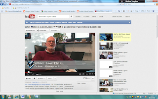
Here are some screen grabs from the video's I watched:
In this print screen a college proffessor talks about what makes a good leader in a college. He spoke about reaching out to the students and ensuring they get the maximum amount of support the college on a whole can offer. Whilst also ensuring that students are independent and able to work alone.
This print screen shows a college lecture giving a step by step presentation helping students deal with their problems head on
Using microsoft powerpoint, I took it upon myself to create a rough layout of what I wanted my contents page to look like. This made it easier when it came to how effectively I used the tools on InDesign and Photoshop as I had a clear idea of what I wanted the end product to look like.

1. My media product used and challenged the forms and conventions of real media products in several ways. I used conventions of a real magazine as I had all the key features that would be in a real school/college magazine contents page. I did not develop the conventions of a real magazine as I did not feel this was neccassary as my magazine had all the features that I wanted without developing on the layout of magazines that are already on the market. I challenged the form and conventions of a real magazine as my layout was original and unlike any school/college magazine currently on the market.
INSERT MY CONTENTS PAGE & ONE THAT'S THE OPPOSITE
2.My contents page represents various social groups as it features articles for people who enjoy sports, music, fundraising etc and has something that different types of people would enjoy taking part in or just reading about.
3.EMAP would be the media institution to distribute my media product. I decided on EMAP as I feel since the company made the change to business-to-business magazines, my magazine will be taken seriously by members of the general public as well as the audience my magazine is intended for.
4. The audience for my media product would be students attending the college, parents of the students and teachers, gouvernors of the college etc as they all have links to the college and would benefit from knowing what is going on in the college.
5. I did this by ensuring that the images, color, font and layout of my magazine was something that would appeal to my target audience and something they could relate to. For example using neutral colors so that it would appeal to both males and females and the layout was simple. I made sure my cover lines were easy to locate and understand through where I positioned them on the page and the color of the font I used on particular cover lines to make sure the text did not clash with the background image.
I also feel I atrracted my audience by displaying my specific social group on the front cover
I also feel I atrracted my audience by displaying my specific social group on the front cover
6. From creating my magazine front cover on both Photoshop and InDesign I have learnt that using layers in InDesign is important and helps when it comes to organisation and how different things look on a page. For example experimenting with fonts but not wanting to delete the background if the font is on a different layer from the background the background can be hidden by the click of a button. I found this very useful.
INSERT CONTENTS PAGE & ANNOTATE


No comments:
Post a Comment